Simple lettering: the word ‘Porsche’. No more. In 1948, this was all that was needed – as far as the pragmatic creators of Porsche were concerned – to describe what we now see as a roadgoing icon. Legend has it that the individual aluminium letters were made by an apprentice using a jigsaw and were designed to feature on the Porsche 356 ‘No. 1’ Roadster for its first race-winning performance at the Hofgarten road race in Innsbruck, Austria. However, today we recognise a Porsche by its famous crest.
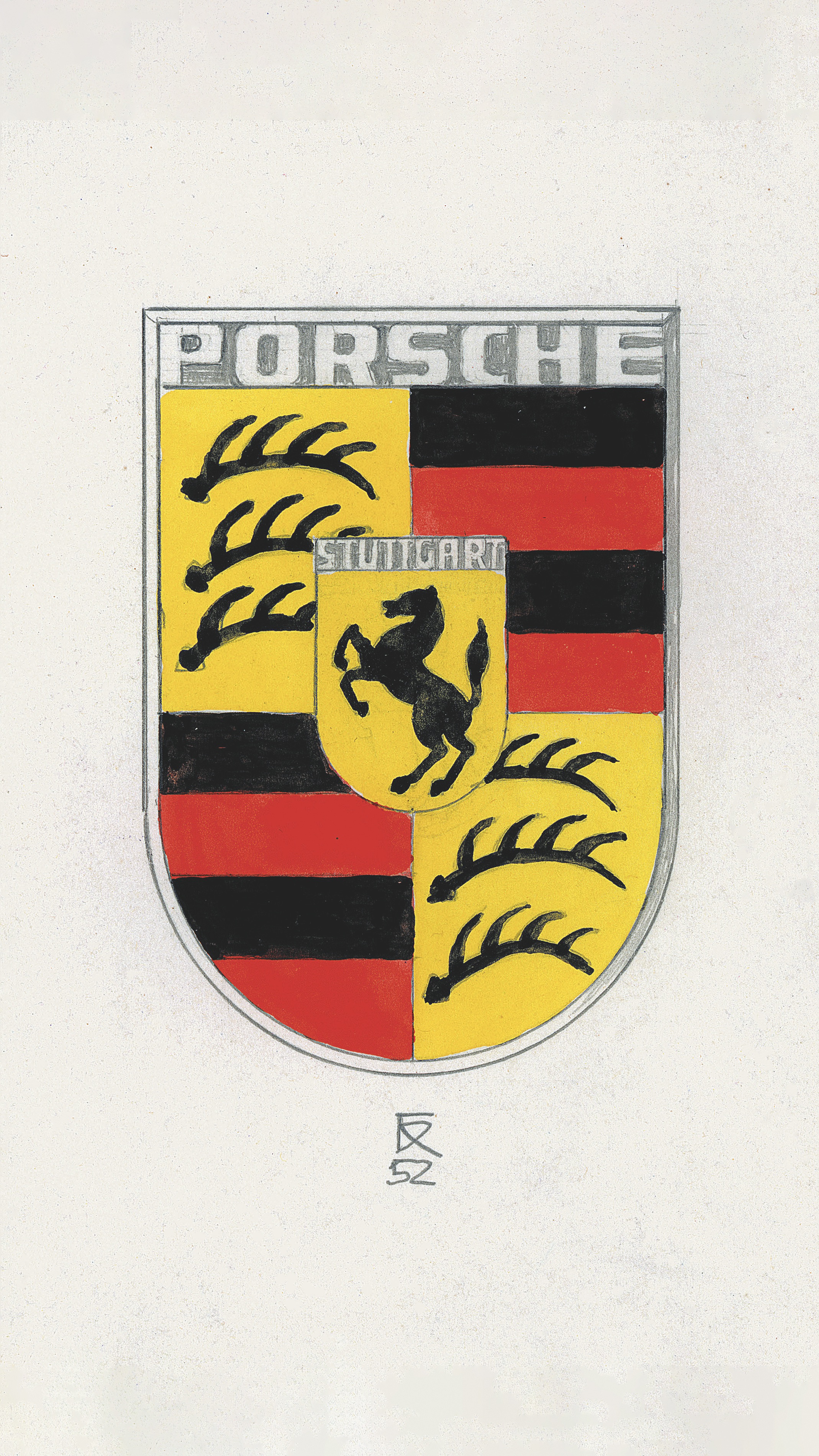
As early as 1951, Dr Ottomar Domnick, one of the very first avowed Porsche fans, took the initiative. He launched The Porsche Prize, a competition to find a logo for the new brand. However, none of the various designs submitted fit the bill. Then, at a business dinner in New York at the end of 1951, Max Hoffman spoke with Ferry Porsche and revived the idea of designing a logo. As Ferry Porsche wrote in his notebook on 27 December: “Steering wheel rim decorated with ‘Porsche’ and the Stuttgart crest or similar.” In 1952, designer Franz Xaver Reimspieß, a talented draughtsman, created the decisive design: a rearing horse, taken from the seal of the city of Stuttgart, depicted within the contours of a golden shield. Together with the name of the city of Stuttgart above it, the design represented a clear commitment to the production of cars in Zuffenhausen. The surrounding red and black state colours and the stylised antlers are taken from the traditional crest of Württemberg-Hohenzollern – with the Porsche logo forming a protective arch over everything else.
A crest that made an impression
It is an intricate work of art and unifies so much of what distinguishes Porsche. It’s also clear proof that projects undertaken with conviction and which come straight from the heart can make an impact, even in the absence of formal training. Porsche now had, with its crest, a logo that would make an impression – not only on the cars themselves, but on letterheads and in advertisements and publications. But it would also attract controversy.
First, to understand what a detailed logo with many colours signified, we need to wind the clock back. In the 1950s, colour printing was still very expensive, and also rather complicated. Not every printer had suitable machines, for example, nor was it easy to create printing plates, or to set registration marks with precision so that all the print forms were positioned exactly on top of each other. Creating a clear, sharp graphic or image without the print screen slipping was therefore tricky. Moreover, the Porsche crest didn’t look nearly as elegant as a stark black-and-white version. Porsche sales managers and the dealer organisation also saw another problem, which was addressed by writing to Porsche and its head of advertising, Hermann Lapper, in 1961: “The different colours and many details as a whole do not amount to a compact, coherent visual effect in road traffic.”
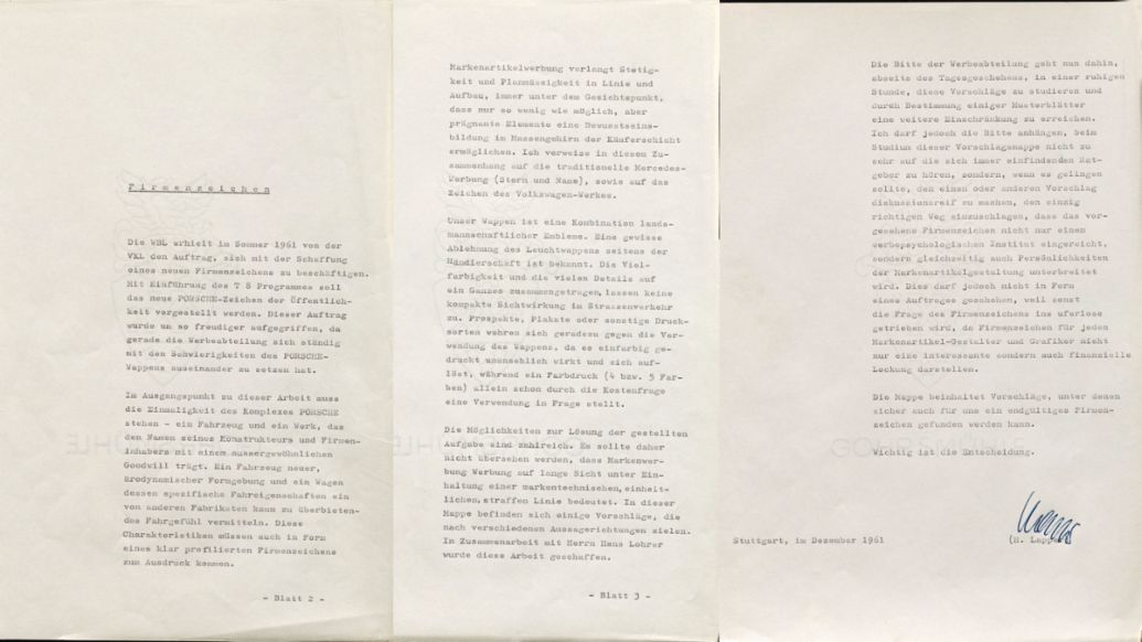
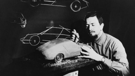
The Mercedes star and the VW logo (also designed by Reimspieß) were presented as examples of good design. After this, a variety of designs were created in collaboration with Hanns Lohrer. Lohrer, a gifted commercial artist, was responsible for many influential posters and advertisements at Porsche in the fifties and sixties. He was a creative force of nature who, like Erich Strenger, left his mark on this Porsche era.
A new logo
Now a really significant task was being asked of him: to create a new logo. It was to be launched with the ‘T8 programme’, the successor to the Porsche 356. But nothing came of this.
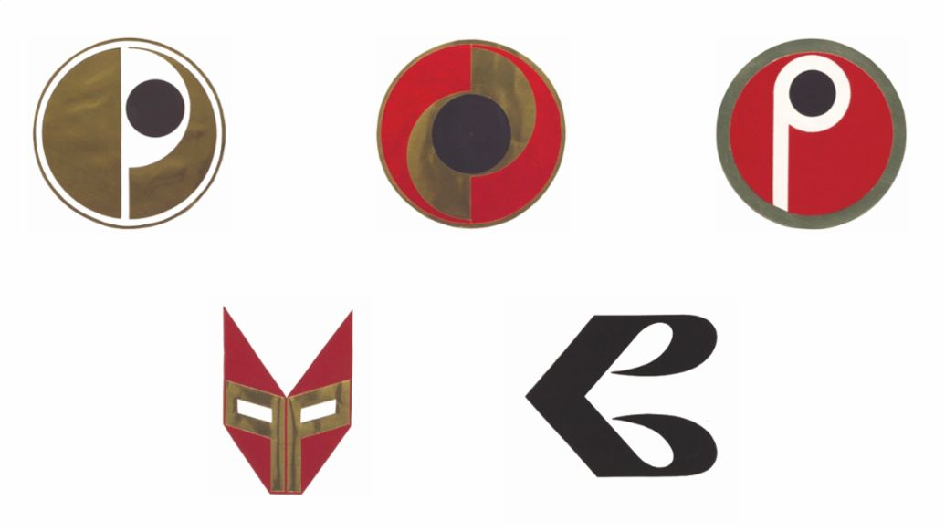
It is only thanks to the precision of Porsche secretary and chronicler Ghislain Kaes that we even have knowledge of these plans. Aside from this correspondence, no evidence of the efforts made at that time can be found in the company archive.
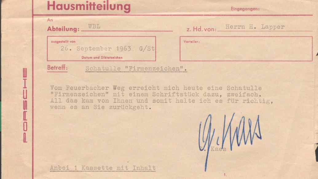
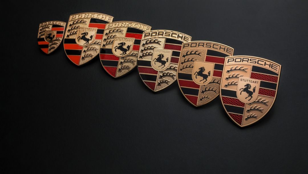
A decision was presumably made that the logo that had been in use since 1952 was already too established for a sudden change of direction to be a good idea. But this is only conjecture. Ferry Porsche once made this argument when Ottomar Domnick suggested to him that, with its rearing horse, the Porsche crest was too similar to the logo of the Reutter coachbuilding company. Today, the crest is above all one thing: unmistakably Porsche. Even in its sixth iteration.
Info
Text first published in the magazine Porsche Klassik 28.
Author: Thorsten Elbrigmann
Photos: Company archive of Porsche AG
Copyright: All images, videos and audio files published in this article are subject to copyright. Reproduction in whole or in part is not permitted without the written consent of Dr. Ing. h.c. F. Porsche AG. Please contact newsroom@porsche.com for further information.

