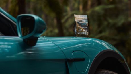
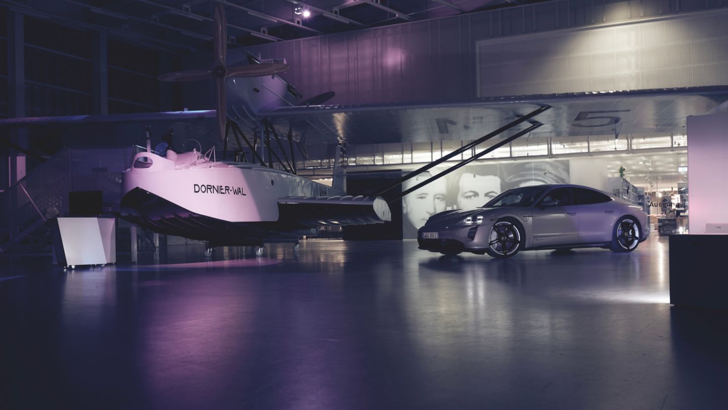
It all started with ice cream and a helping of courage. “Some people remember songs or fragrances after interesting encounters. I automatically remember colours,” says Daniela Milošević, a designer in the Colour and Trim Design department at Porsche’s Weissach Development Centre. For instance, when she thinks back to a visit to the Dornier Museum in southern Germany, the colour olive remains in Milošević’s mind. Olive, with gold-coloured pearl gloss pigments: young and invincible, expressive and dynamic.
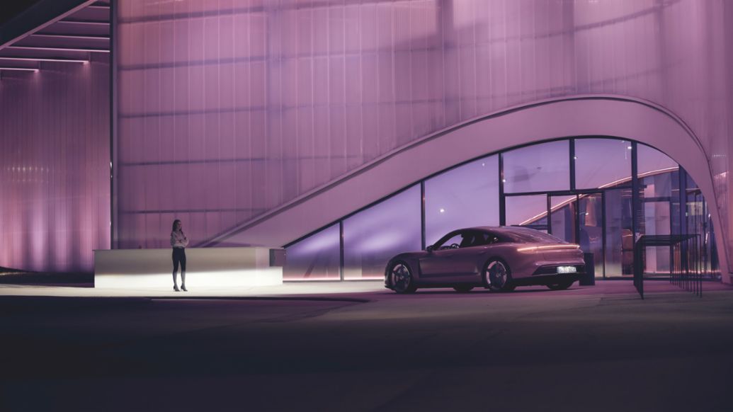
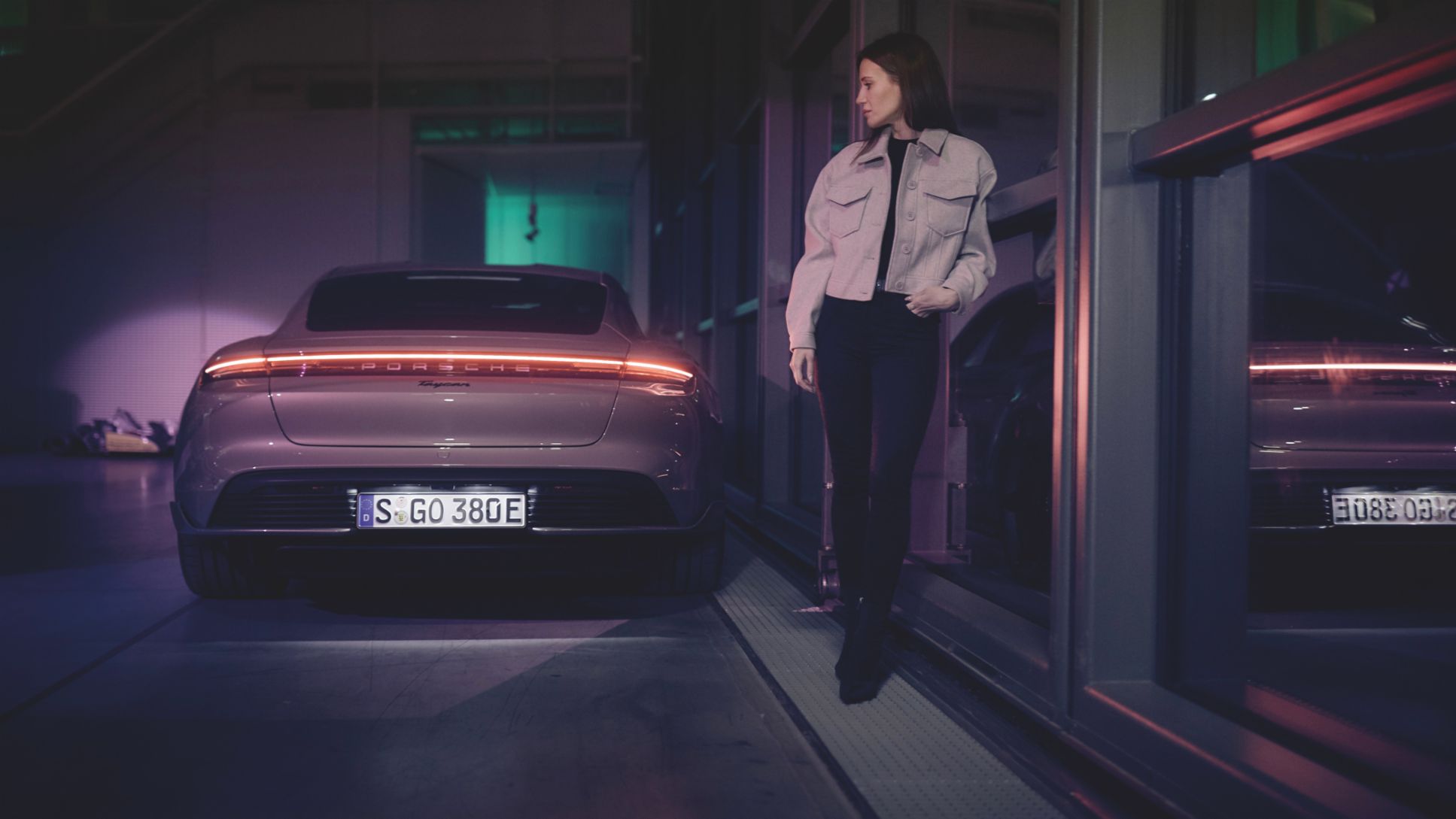
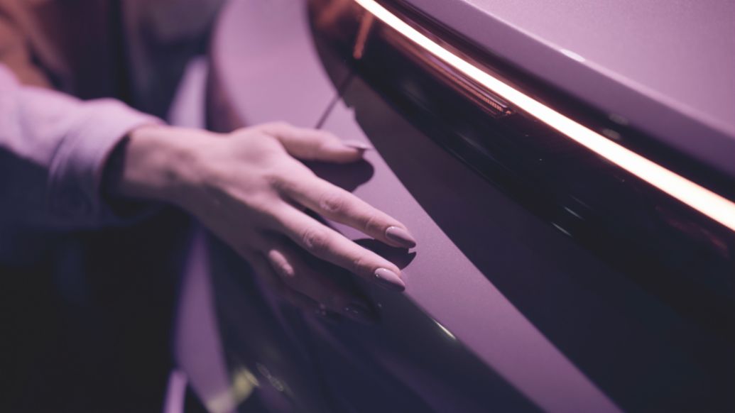
The museum's night lighting and the Porsche Taycan share the colour Frozenberry. A mix of old rose and light grey with a hint of pink. When developing the colour, the Color & Trim team had not yet thought about the shape of the all-electric sports car, but rather the theme that surrounds the Taycan. "The electric world is characterised by purity and clarity. It is white, so to speak. But we also wanted to offer our customers alternatives," explains the Stuttgart native.
Courage in the choice of colours
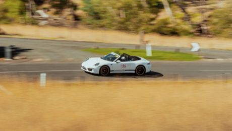
So the team started to explore the world of pastels. Created an ice collection, a metallic trio consisting of Frozenblue, Frozenberry and Coffee Beige. "We picked up the pastel world to perfectly convey electrification," says Milošević. All three colours are very well received by customers. When developing Frozenberry, the colour designers originally thought of the Asian market: "Asians are very courageous in their choice of colours." But then the Europeans also showed courage. Actually, Frozenberry was just the working title, she reveals, but everyone involved liked the name so much that there was no need for an alternative.
The creative specialists obtain their inspiration above all from the world of interiors. “We use interior design and architecture as a source of ideas for our work. Fashion moves too fast. In contrast, customers buy a sofa and keep it for several years – like a car,” says Milošević. Polarisation is allowed in Weissach, and is perhaps even necessary in order to be visionary. After the Milan Furniture Fair, the designers think about which colours are missing from the range and which shades have not been in the standard selection for a long time. They then take a journey into the future in their minds. “We are always at least two years ahead, because we must recognise and set trends. At the same time, we must never lose sight of the brand’s DNA,” explains the colour designer, who has been working at Porsche for 13 years.
Between reality and vision
She started an apprenticeship as a vehicle trimmer in Zuffenhausen at the age of 17 and later studied Transportation Interior Design. Milošević doesn’t just develop paint colours now, but is also responsible for the colours of films and wheel rims. “It is great to have seen both the makeable as an interior outfitter and the visionary and free as a designer,” she says.
The paint colour that Milošević is considering today will not be approved for three or four years at the earliest, and not before it has been through many tests. Among other things, it must be able to withstand exposure to the weather. For this, test panels are placed in bright sunshine for two years. “Anything that passes the colour stability test in Florida is most certainly light-fast,” she says. This is followed by fire safety, salt water and stone impact tests. The team creates around 12 paint colours for new models and derivatives each year. From these, four are usually chosen and developed.
Pantone and NCS colour systems
“I have my own mixing bench and love reproducing recipes or creating new ones myself.” The basis is always very important: everything starts bright and white and the designers then slowly move forward into the pastel world or the world of bright colours with small buckets and scales. They use Pantone and NCS colour systems rather than the European RAL chart, because they “offer more nuances”.
The paint specialists then apply the colour to sample plates known as ‘colour frogs’, which look like small models with a 911 silhouette. To test whether the exterior colours also perfectly match possible interior materials and colours, the designers work closely with their colleagues responsible for the inside of the vehicles. “Many of our customers would also like to see the exterior colour in the interior. That is why the colours must coordinate with each other and enhance the character and features of the vehicle,” says Milošević.
“A lot of things revolve around colours in my life. The working day never really ends for me as a designer. Even moods take on a colour for me.” She does not have a favourite colour because: “I cannot concentrate on a single colour. Instead I allow myself to be led and guided by colours.” She will think of shades of rose later, on her way home – a calming colour that she associates with the feeling of trust. Until then the night she visited the Dornier Museum will remain in her mind as Frozen Berry.
Info
Text first published in the Porsche Klassik Magazine, No. 20.
Author: Christina Rahmes
Photographer: Maximilián Balázs
Copyright: The image and sound published here is copyright by Dr. Ing. h.c. F. Porsche AG, Germany or other individuals. It is not to be reproduced wholly or in part without prior written permission of Dr. Ing. h.c. F. Porsche AG. Please contact newsroom@porsche.com for further information.