The customer – the unknown quantity? Perhaps it would be better to refer to customers as challenging quantities, especially when it comes to designing technical devices for them, or programming software to suit their needs. The reason for this is no surprise, of course: there is no “one” customer to identify, but many diverse individuals, each with their own specific interests. Even the touchpoint between human and machine (the user interface or UI) is a challenge in its own right. Here rational technology; there the “vagaries of human thought”, as psychologist Donald Normal wrote in 1988 in his book “The Psychology of Everyday Things”.
He observes: “We still cling to the notion that human thought should be rational, logical, and orderly.” However, the truth is quite different. Thinking, problem-solving and planning seem to be rooted more deeply in past experiences than in logic, as people hop and skip from one idea to the next; they combine things that do not belong together; they make creative leaps; unearth new insights and concepts.
That is still how it happens 30 years later – though one difference is that in the meantime, Norman himself coined the term “user experience” – or UX – back in the mid-1990s, when he was heading Apple’s Advanced Technology department. Rather than concerning himself with technology in pure usability terms, he focused on the holistic experience of users dealing with technology. What this means in practice is now known to every child, and has been at least since the launch of the iPhone and its intuitive gesture control.
User experience concept
Norman’s UX concept has really taken off as digitalisation has advanced and continues to penetrate into more and more areas of life – including at Porsche. “We are not interested in digitalising at any cost, nor do we do it for its own sake,” CEO Oliver Blume says pointedly. “We only digitalise where doing so will benefit our customers. And we only do it if they want us to.”
But what is it that customers want? The mission of the UX/UI experts at Porsche is to take on the customers’ viewpoint to ensure the company has its finger firmly on the pulse when it comes to future developments and features in various areas, especially in terms of digital topics.
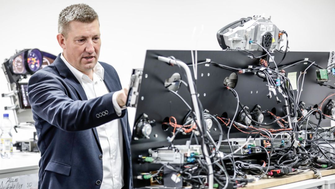
The UI/UX display and controls department is part of this process. “We take note of all the suggestions and requests that our customers send to the Sales team and then on to colleagues in the Development department,” manager Lutz Krauß says, explaining the first step on the path to perfectly tailored UIs. A top-class UI is of decisive importance for the kind of UX Porsche seeks to offer its customers: simple, fast and emotional. And in a digitalised world, there’s ultimately just one aspiration: technology and fascination need to be translated into products that can be used quickly and easily.
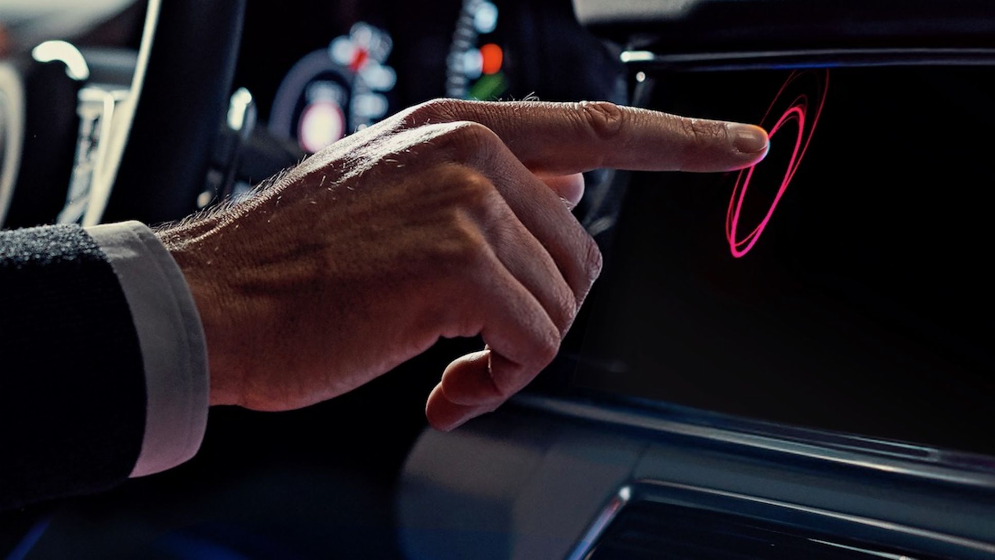
“A meaningful user experience is more and more important at Porsche,” Krauß emphasises, highlighting the trend towards digital clarity. “In many cases – such as in the structure of control menus – it’s often true that for us, less is more.” That was presumably the guiding principle for the recently designed operating controls for the climate control system that will be used in future models: for the first time, these do not feature any mechanical elements that are visible to the customer, as all the controls are adjusted via a touchscreen. “In future there will be two pre-defined settings for regulating air flow: focused for rapid cooling, and diffuse for pleasant conditions on longer drives,” explains Erik Kögler.
The UI is able to accommodate all the most-common customer requirements with these two scenarios, meaning it is no longer necessary to adjust several different individual settings to suit the situation. That said, in specific cases customers will still also be able to regulate detailed settings, and it will in fact be possible to select an air flow setting that reflects their own personal requirements, in Individual mode. The UX/UI experts are constantly thinking about intelligibility from the customer perspective. The focus is on moving from the technically possible towards what is best for the customer, and so customer needs are the decisive yardstick when it comes to developing new functions. “We often also take on a kind of mediating role between the various requirements of the different departments,” adds Erik Kögler. In any case, the team always works closely with the UX specialists from Design and Technology.
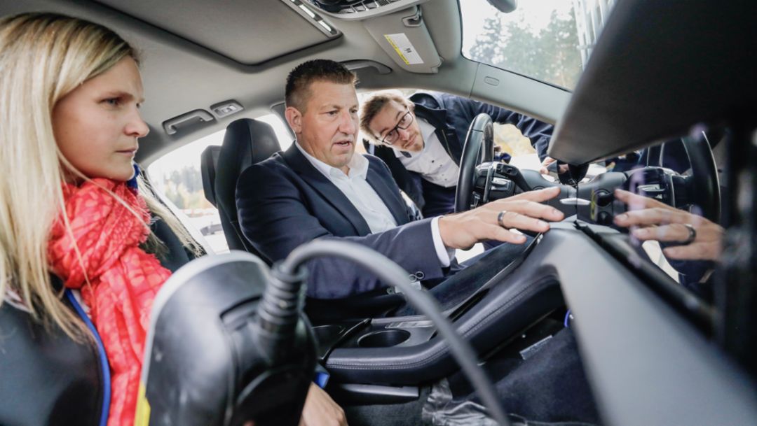
“We hope that using a simulator to get inside the cockpit of the next generation of Macan will yield some new insights – that’s when customers will use the future technology for the first time,” reveals Lutz Krauß. “While they perform various tasks using the new UI, we will sit in a neighbouring observation room with our colleagues from the Development department, and watch everything that’s going on via camera feed. So if we see that five customers in a row are unable to find a virtual switch or understand a function, it’s obvious that we have some work to do.”
The work of the UX/UI team extends well beyond the vehicle itself, too: the charging cable box (Mobile Charger Connect) developed for the Taycan and future PHEV vehicles has its own user interface, with a graphic display that resembles the standard display inside the vehicle. “We have implemented the control logic in a way that customers can understand as quickly as possible, and which can be displayed at the same time at different touchpoints,” explains Sigrid Engel, who works with her colleagues at EEC4 to ensure that all the charging interfaces are uniform in appearance.
Another relevant area that falls outside the actual development of the vehicle is the electronic vehicle routing card (EVRC) that is used in production. Where previously information was attached to cars in paper form, the EVRC now digitally records this data, along with the necessary work and testing steps for workers. The EVRC is continually being optimised as an essential tool for process automation, diagnostics and documentation, with the user-centred design process supported by the EEC4 UX/UI experts.
Collaborative driving
Sometimes the view ahead even extends beyond the next generation of the series – at present the UX/UI team is working in collaboration with the Volkswagen Electronics Research Laboratory (ERL) in Belmont, California, researching interior design for partly and fully automated vehicles. “The idea of collaborative driving emerged during a test drive with a partially automated car,” reports Krauß. “We became aware of a possible situation arising where someone might wish to instruct the self-driving car to take a particular action, but they cannot take the steering wheel because they don’t want the car to quit autonomous driving mode.”
In instances like these, a brief “Overtake now!” voice command or perhaps an innovative input device operated with a stroke of the hand could offer a way of temporarily overriding the computer with a clear command. With this in mind, Krauß is positive in his outlook: “You can see that even in a world of fully automated vehicles, there will still be enough work for us.”


