Keeping up with the digital environment means adapting to constant change
Technology continues to develop at a staggering pace. As a consequence, the development and design of digital applications have become extremely complex and fast-paced. For the digital design of any premium or luxury brand, a seamless experience, a unified, consistent and high-quality appearance covering all digital touchpoints is crucial.
For a few years, I am one of the responsible for the digital experience and visual design of Porsche’s digital ecosystem and faced the challenges first-hand. As our service portfolio grew, so did the inconsistencies and silos. It became very clear to me that we needed a systematic change — a structured foundation to safeguard consistent, efficient and valuable design. A system to meet our external and internal challenges and to leverage the evolution of our design culture. A design system.
As a reaction to the changing environment, we started to transform the way we work: We break our interfaces down into smaller parts that are more manageable. They are separately designed and developed by distributed agile teams with dedicated responsibilities. But still, everything exists within a larger ecosystem — a globally growing ecosystem of many different products and services.
“Building a design system is like LEGO — including the building bricks and a child-friendly construction guideline.” Marcel Bertram
Pre-building design elements — or: Playing with LEGO
In order to secure consistency and brand recognition, it needs design resources that ought to be used in the correct combination across all touchpoints.
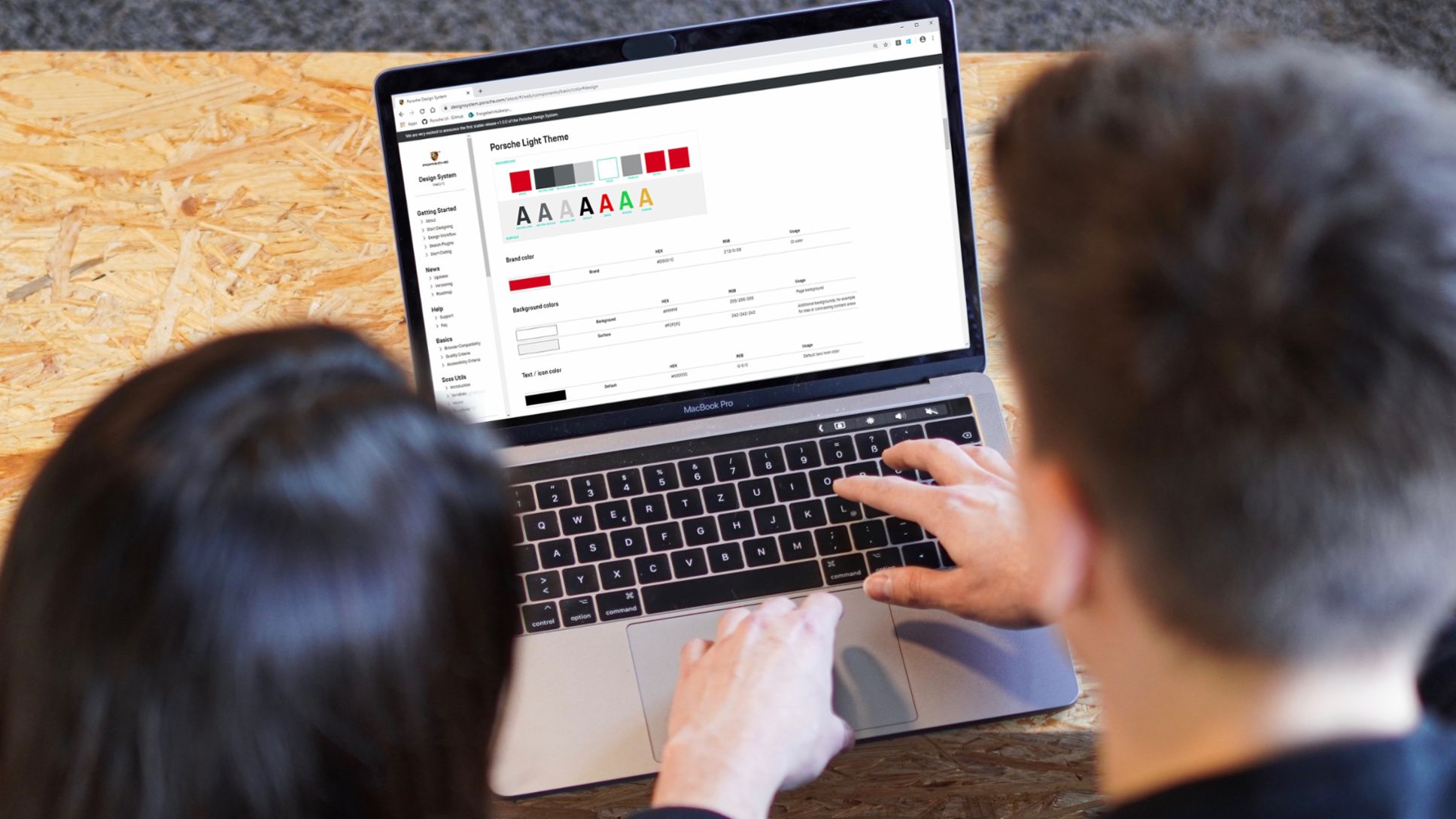
We started with the Porsche design basics that form our unique brand identity — the marque, typography, colors, icons and spacings. Then we re-used these basics in a specific combination to built our design components, our LEGO bricks. This includes, for example, buttons or form elements and always goes along with corresponding usage guidelines for our consuming teams.
The design basics, the design components and the guidelines form the heart of our digital design system. They will help us to create flexible designs with a consistent and brand-appropriate appearance.
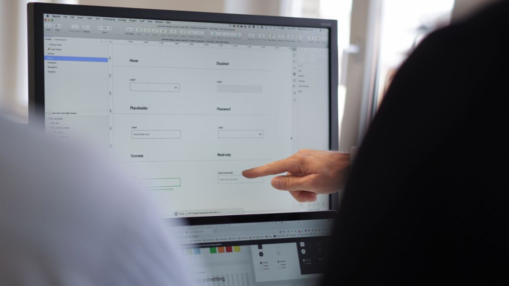
Looking good is not enough: About functionality and accessibility
User-friendly designs require intuitively and inclusively designed components — the building bricks of all applications. They must work for any supported technology, any device and operating system that our customers use. And they must enable accessibility for everyone, regardless of disabilities or cultural differences. All components must ensure readable text, sufficient interaction size, high color contrast — and everything that makes users feel comfortable.
Thus, we put a lot of effort in research, benchmarking and testing of all design components. We wanted to increase trust in our delivery items and to ensure usability improvements.
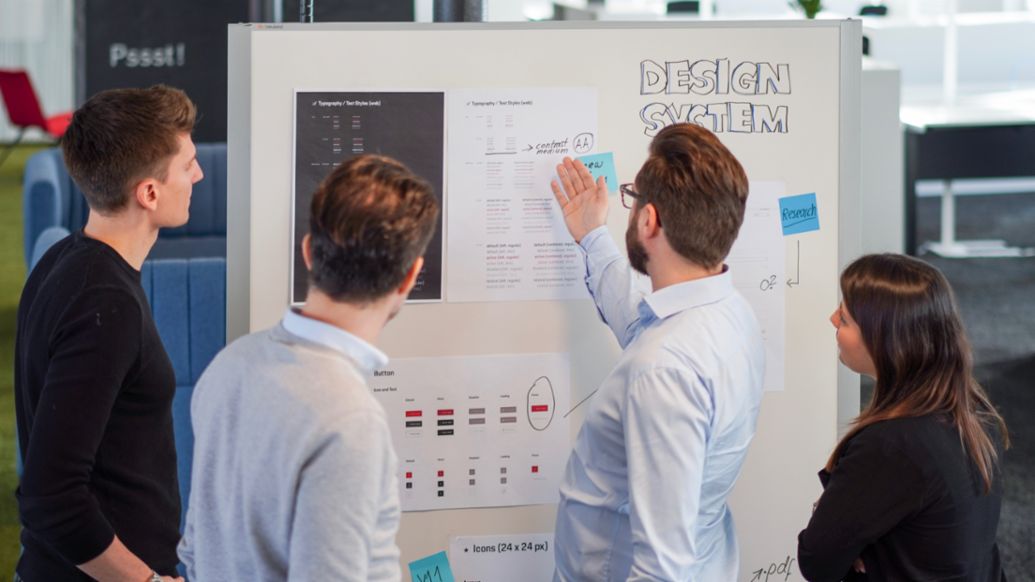
Efficiency and collaboration: let us shift the focus to value
Reusing pre-built design elements not only aligns all touchpoints in consistency and quality, it also helps our organization to design more efficiently and improves the communication with each other. The best way to reduce the team’s workload and avoid misunderstanding is to have a system covering both — design and development.
To lift the greatest potential, we needed real artifacts that can be used both for high-fidelity screen designs and prototypes as well as for the productive code of our applications. For our designers, we create Sketch libraries with easy-to-use styles and symbols. Developers get exactly the same elements in forms of real-coded web components — a technology to be used in our heterogenous Porsche ecosystem of products built with different frameworks. As a result, designers learn to use codified elements as their working material and developers get a better sense of the importance for an appealing and usable look and feel.
Everything we provide must fit seamlessly into the habitual design process and tools of our teams to make their work easier and better. And as we no longer spend time on designing basics and pixel-pushing discussions, we can spend our time more productively: in innovations, exploring and testing of alternatives and in focusing our efforts on providing more value for our users.

Digital design is a language — and a design system is the grammar
A design system is about new artifacts, different tools and processes. It is about establishing a common language of design across different roles and teams and improving the way we work together.
“A design system is more powerful than it appears. It’s like a trojan horse going into a big organization to ignite bigger cultural change.“ Jordan Fisher, Design Director Idean
In order to build and run a robust, scalable and valuable Porsche design system and to empower its enterprise-wide adoption, we needed more than just the right components and technology. Looking back, I’m really thankful that I had the chance to form a dedicated team for this task. A team of people who share the passion for improving digital design at Porsche — and even more important: People bringing in the necessary expertise to do this.

Developing our new design system drove change. It sparked cultural changes and new impulses and has the power to evolve our whole digital design culture at Porsche — and I couldn’t be more proud of this transformation.
Info
Text published by Marcel Bertram, Specialist Digital Marketing UI/UX at Porsche.
