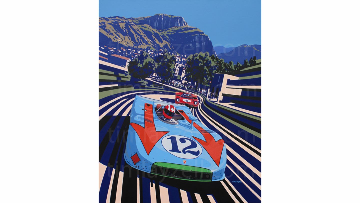
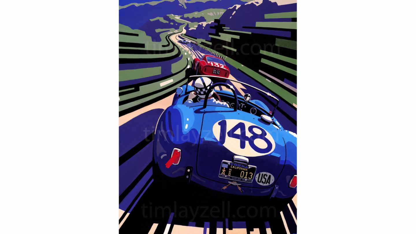
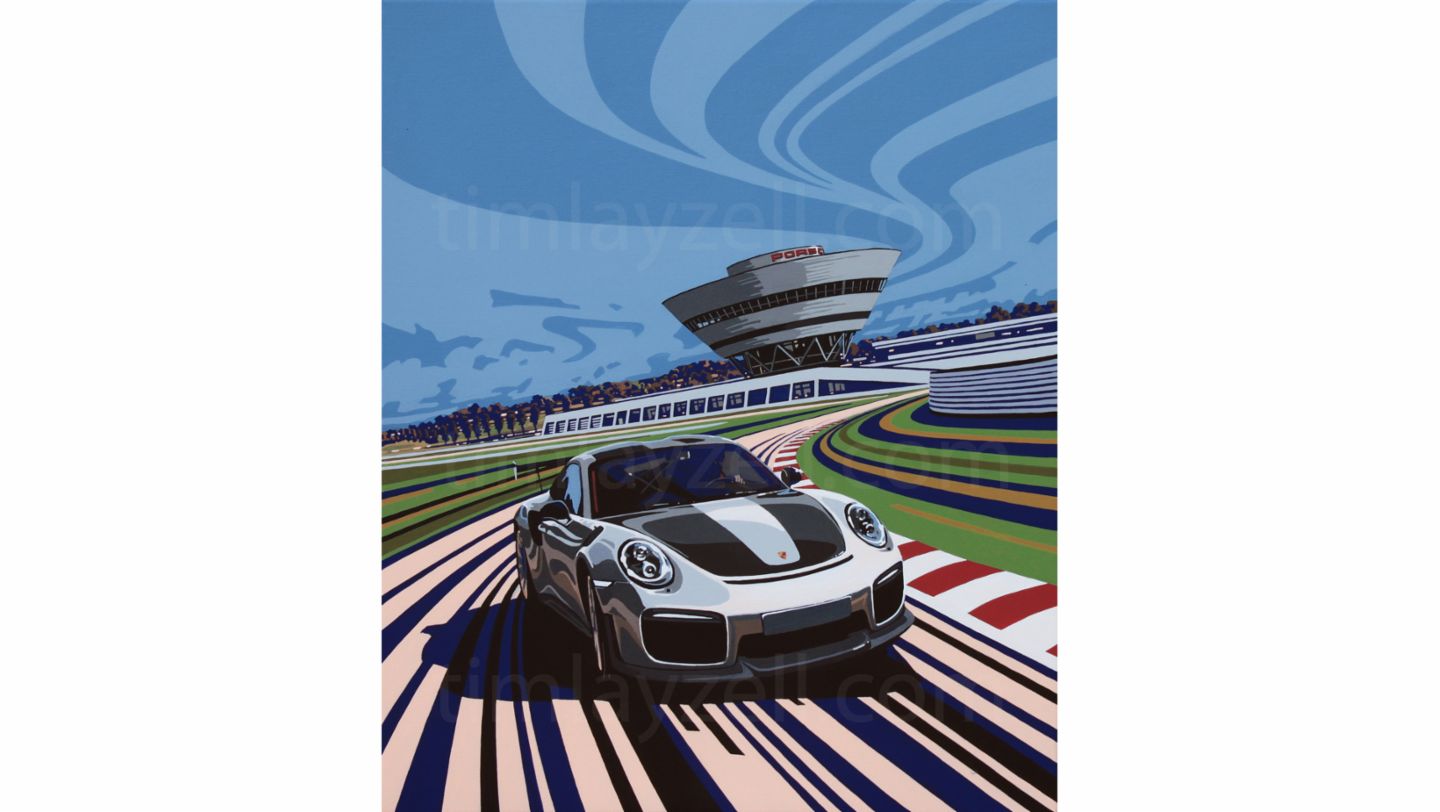
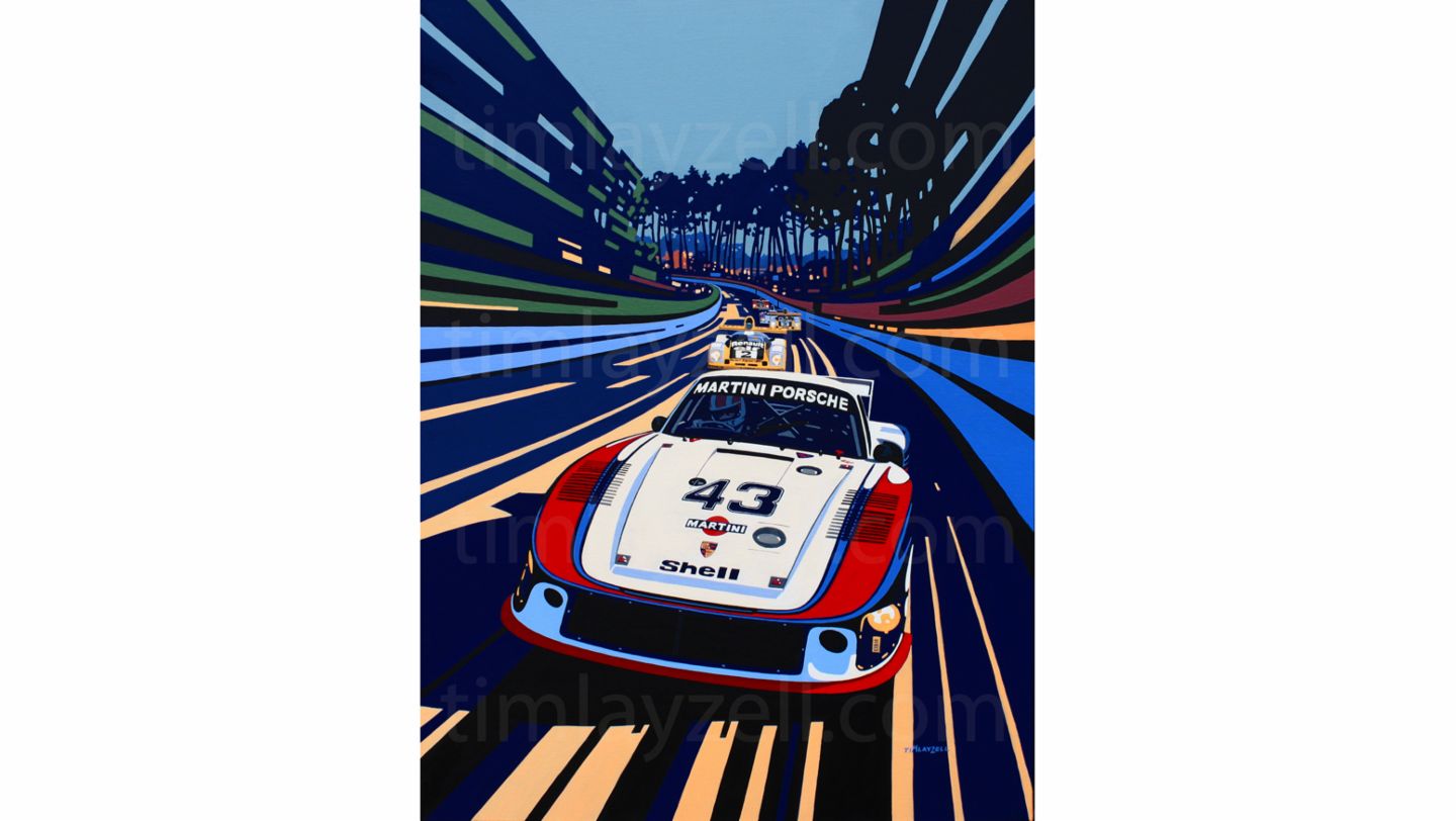
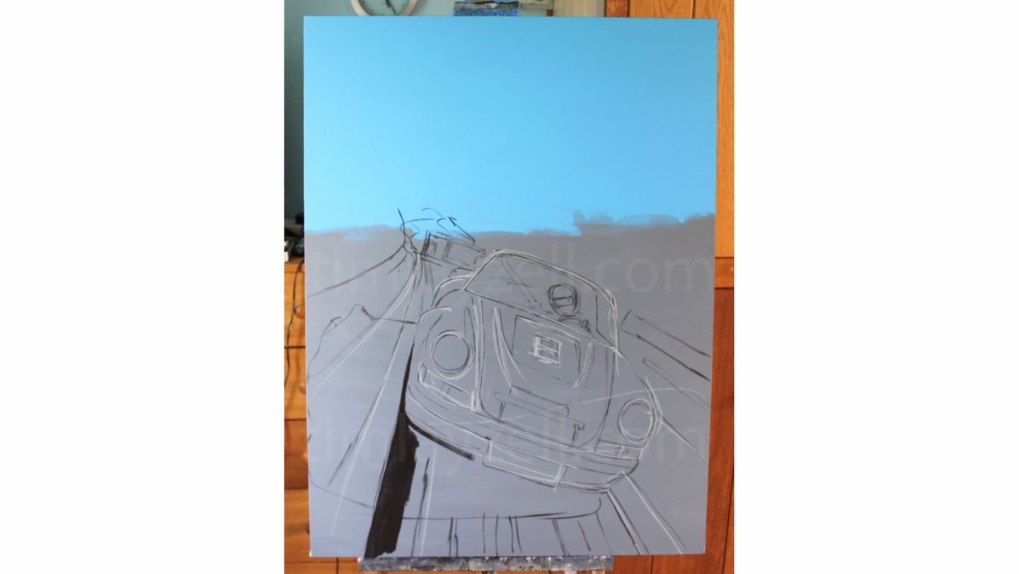
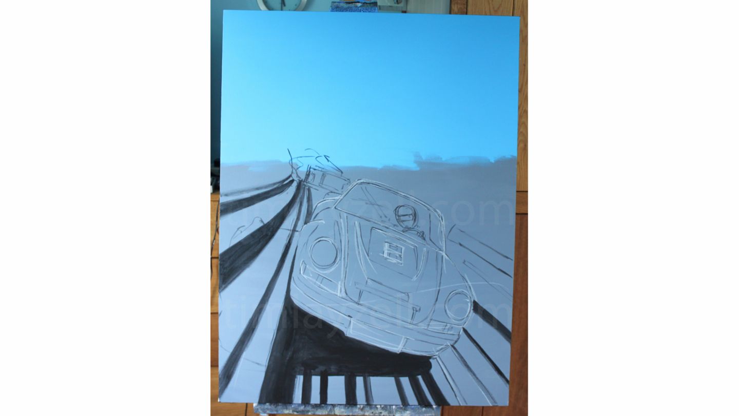
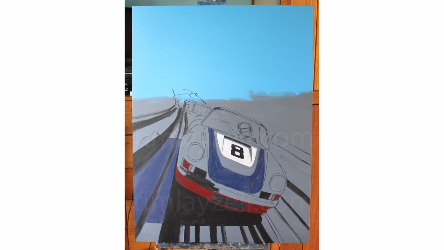
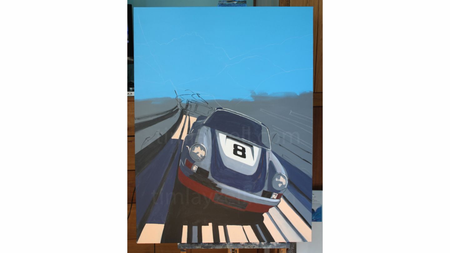
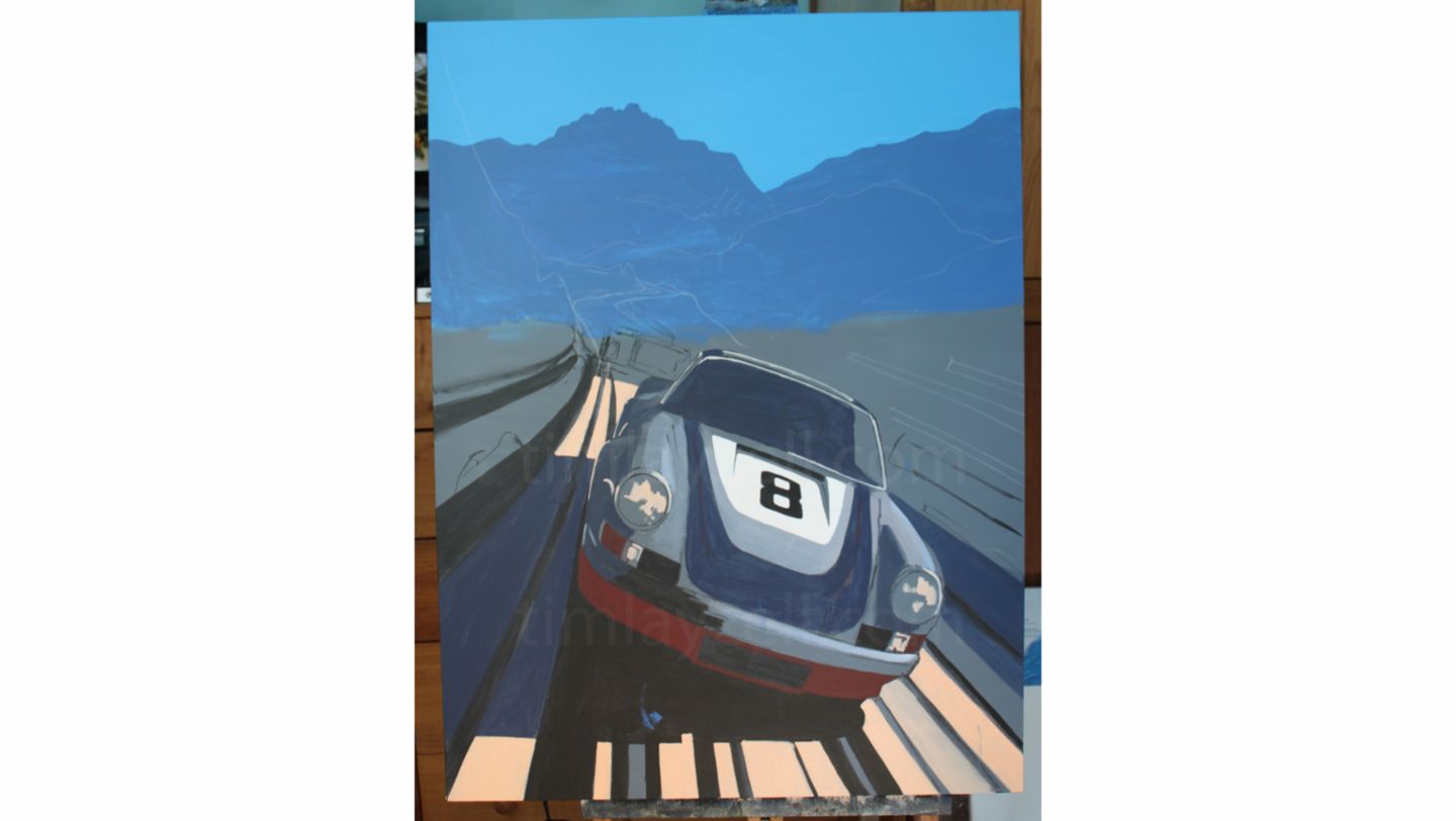
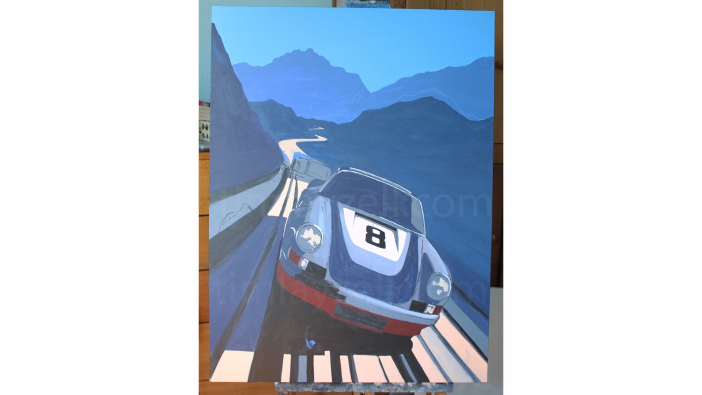
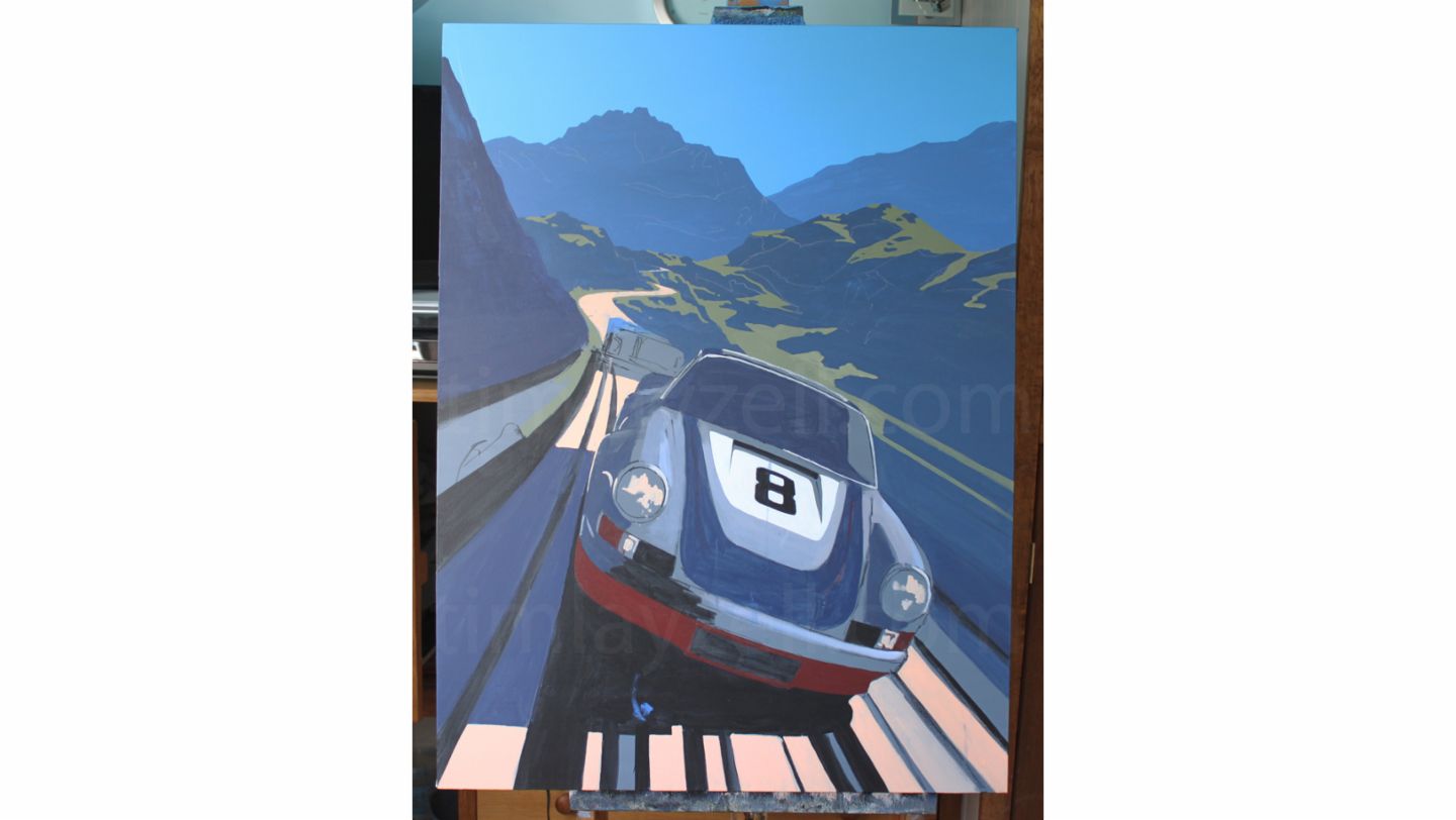
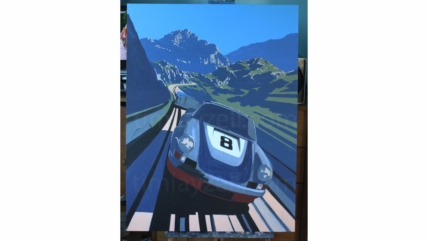
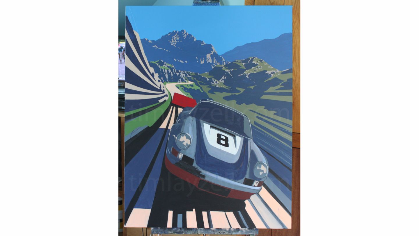
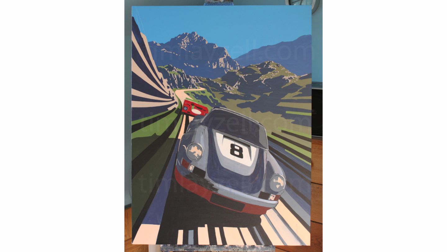
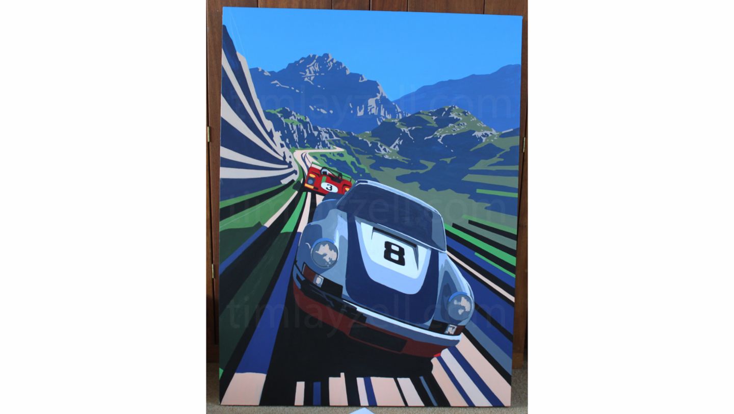
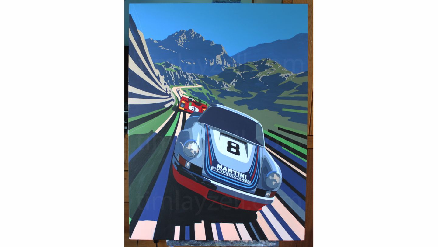
In a small artist’s studio south of Bath in the west of England, Tim Layzell spends his days lost in a bygone world of vintage racing; the sounds, the colours, the speed and the danger brought back to life by brushstroke. In a relatively short time, Tim has become one of the foremost automotive artists in the world, sought after by a growing band of serious collectors for his unique, dynamic style and intimate, rigorous knowledge of the subject.
Layzell’s love of cars started early by anyone’s standards – when his mother was pregnant with him. “My parents used to watch vintage sports car club races with my older brother, and I was taken to Wiscombe and Prescott hillclimbs. From the age of about three, my mum would lay the paints out on the kitchen floor and I’d be drawing Bugattis, ERAs or D-Type Jags.”
The family passion for all things racing meant that the Goodwood Festival of Speed and Revival were soon regular fixtures for the Layzells, as was crowding around the TV to watch the Grand Prix or clambering up a muddy hillside to see the RAC rally. But it was the historic racing that really captured the young artist’s imagination, and what would be his gateway to an unexpected day job.
Developing his artistic style
“I started painting for fun,” he explains, “but at the age of 13 I won the British Racing Drivers’ Club award to find a new motoring artist. I was exhibiting with all the top artists of the time, who’d been painting since the 1960s and 70s, so that really kicked it off. After that it was like my alternative to a paper round really, and every year from then on I would exhibit.”
Still at school, Tim was gradually developing his artistic style, insisting on painting cars to the chagrin of his art teachers. He began to study the Futurists and pop art of Roy Lichtenstein and Andy Warhol. He also drew influence from George Ham, famous for his evocative pre-war posters of the Monaco GP. Today, his preferred period is post-war, from the 1950s through to the 1970s – for many the golden age of sportscar racing.
“That time has always fascinated me. It was the peak of racing really. Obviously it was a really dangerous period of racing’s history, but also a really pure one. After graduation I had wanted to study car design, but decided to give painting a go because I’d already sold half of the stuff I’d done at school, so it was already kind of a job.”
Exposure came fast. A commission to do a Christmas card for classic car dealer Gregor Fisken was soon followed by another of Stirling Moss’s 1960 Tourist Trophy-winning Ferrari 250 SWB. This landed in a broadsheet newspaper to promote the Festival of Speed and Layzell’s name, and style, was out there.
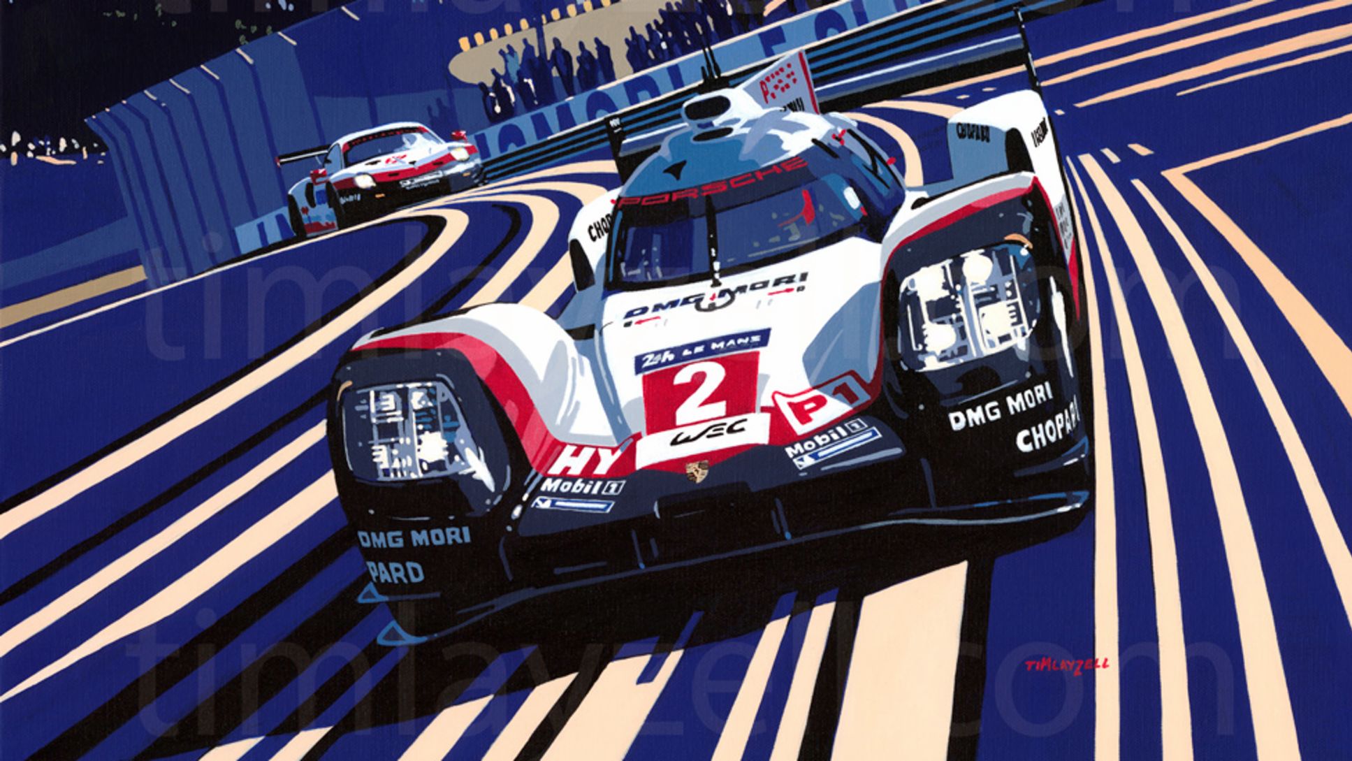
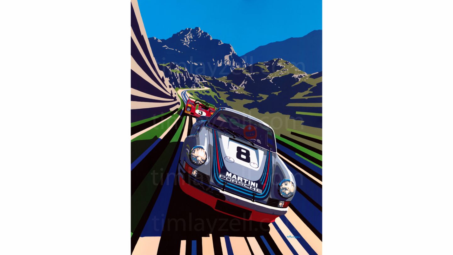
Today, he does 15-20 paintings a year. Following an appearance in Porsche’s customer magazine Christophorus in 2017, he is still fulfilling orders from around the world for owners of classic and modern 911 cars who want their pride and joy preserved for posterity in Layzell’s distinctive style. He has also painted the Le Mans-winning 919 Hybrid at Porsche’s request and the iconic Martini-sponsored 911 RSR that won the Targa Florio in 1973.
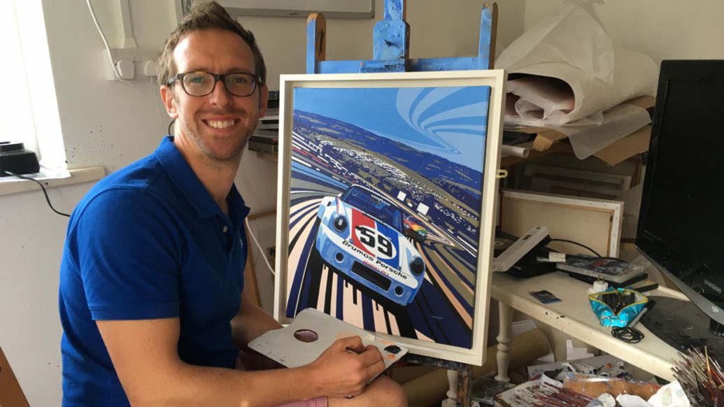
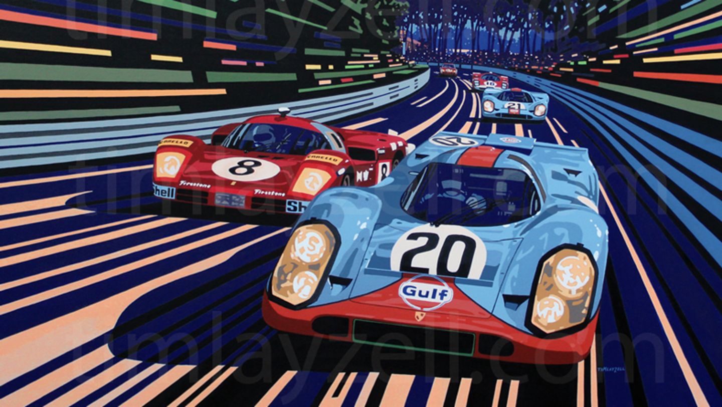
The pop art style he is renowned for is, by his own admission, “quite house friendly”, and he receives more commissions than you might expect from the spouses of petrolheads, happy to have the dynamism and colour of his pictures in pride of place above the mantlepiece. But he also paints in a realist style on occasion, with more muted tones and exacting attention to detail.
“The research takes ages because I want it to be as historically accurate as possible. So for example, all my Targa Florio backgrounds are real backgrounds. I drove the route a few years ago and took lots of photos. I was painting another one of Stirling Moss at Goodwood last year and had to work out the race order at a certain time in the 1959 TT, which is actually pretty hard to find.”
“Patience is a must!” Tim Layzell
While there may be historical evidence to help set the scene, a certain degree of creative thinking is still required to conjure up the ideal atmosphere. “Even with really well-known races there often aren’t many photographs,” he says. “Take the Porsche that won the Targa in 1973. They will have photographed that in the pits and taken a few on corners, but it won’t necessarily be the most spectacular part, so I have to piece that together by finding the ideal background and fitting the cars to it.”
Tim will then spend countless hours ensuring he has the right race order for the given time of day. That any damage sustained by the cars by that point in the race is evident, that the right driver is in the car, that advertising hoardings are correct, that the clocktower is telling the right time. “My wife would say I’m a geek,” he laughs, “but I just like to get it right.”
While this painstaking research lends his work an edge of authenticity, so does a deeper understanding of how a car looks at the limit. After a childhood in the grandstands and now with several seasons of racing his own vintage TVR Grantura under his belt, Layzell has an invaluable grasp of how cars from different periods behave at speed. “In terms of how the car will look, you have to think about how it moves around a corner. A lot of people appreciate that I do love driving and understand about chassis dynamics. In my realist work I tend to put a car on a corner where it’s lifting the inside front wheel. And obviously that has an impact on the back of the car, where the rear wheel is depressed right into the wheel arch. You can feed all of that into a picture.”
Layzell combines the attributes of passion and perfectionism to brilliant effect, evidenced by a stunning body of work. Here, he shares some advice for anyone hoping to follow in his footsteps – or for those wanting to while away a day or two finding their own inner artist.
Getting started
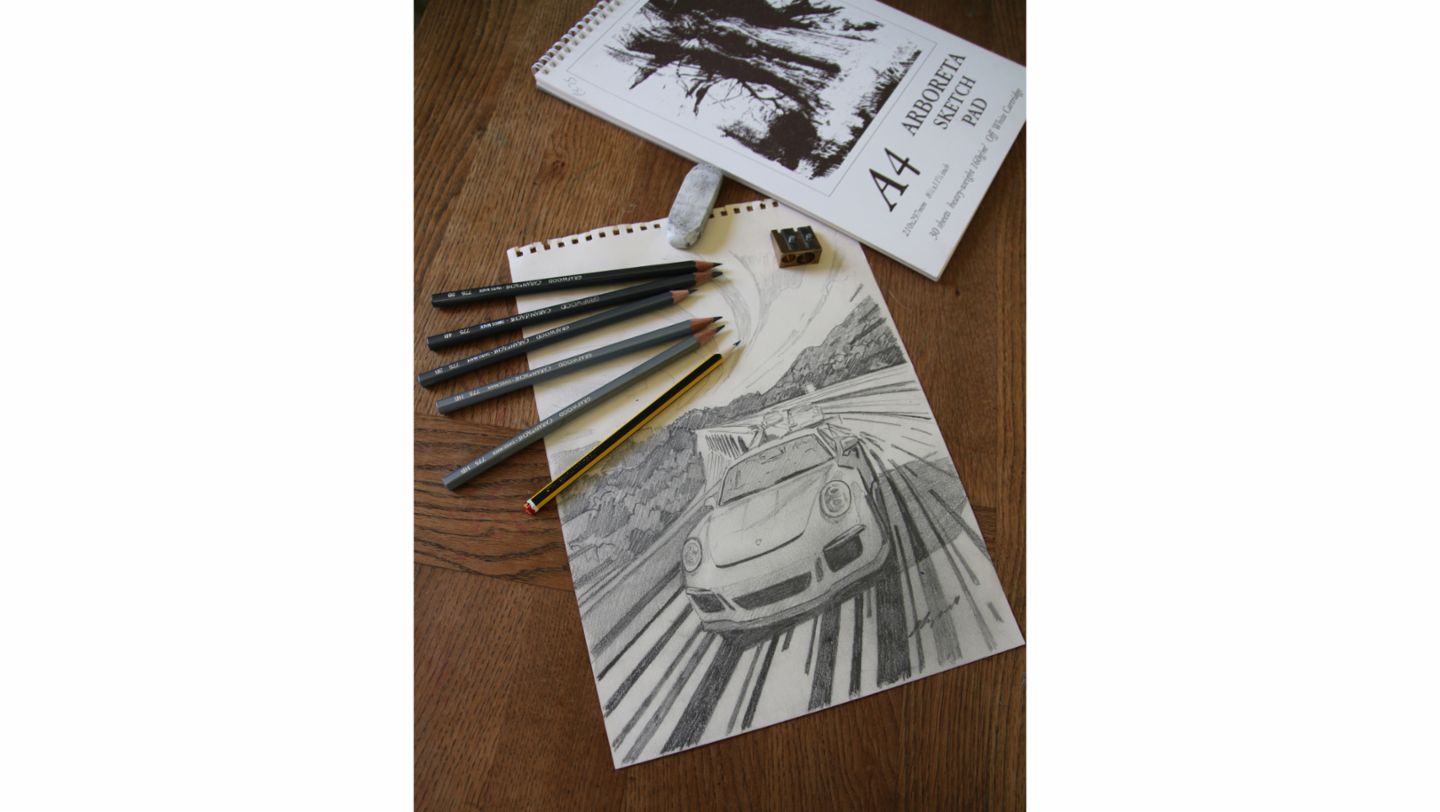
“I’ve spent lots of money over the years on good pencils, but you can’t go far wrong with your average HB. It sounds obvious, but get yourself a decent rubber and sharpener too, and keep your pencils nice and sharp all the time.
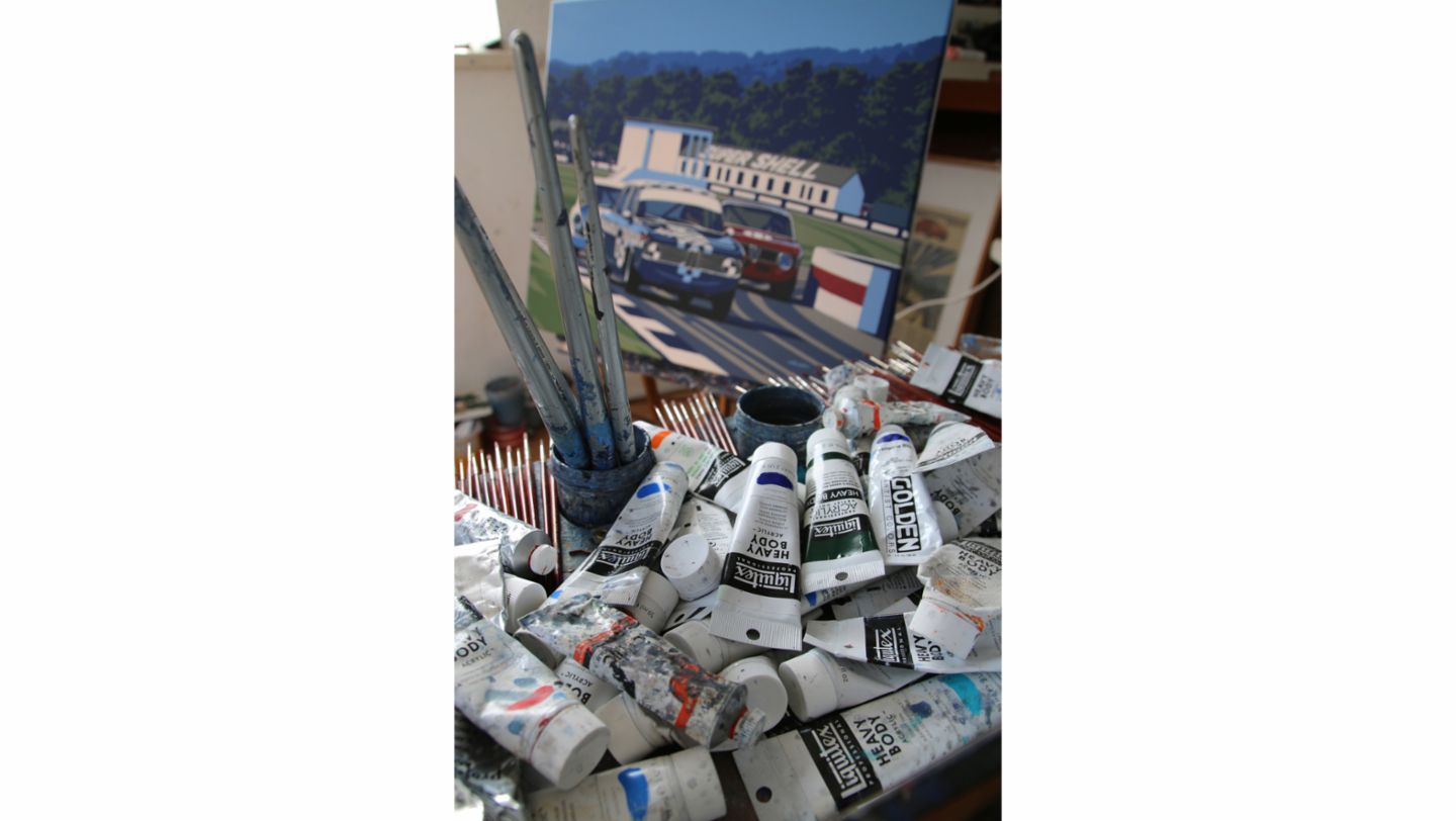
“When it comes to paint, I’ve always worked with acrylics, on canvas. I work quite quickly, which doesn’t lend itself to oil paint because they take so long to dry. It sounds strange to say it, but I’ve been on tight deadlines since I was about 15 years old, and oils would never have dried in time for an exhibition. Pop art also relies on really crisp lines – acrylics are much better for achieving this look than oils
“If you’re drawing from a photograph, which you’ll probably need to be at this stage, keep looking at the picture. You cannot do that enough. Draw the overall picture very lightly and spend as much time looking at the picture as you do drawing. A lot of people concentrate on one little detail and try to get that right, but that doesn’t always work. The best advice I can give is draw the whole form, but really lightly, so you can be sure it’s going to make sense. If something isn’t right at this stage it is much easier to correct it.”
Inspiration
“Around 80 per cent of my work today is commissioned and since appearing in the Porsche customer magazine, Christophorus, various people have asked me to paint their Porsches in certain settings. If it’s a classic car with racing pedigree I’ll look carefully at the history and discuss with the client the ideal race to concentrate on. Then I’ll do some preliminary sketches using different angles to see what works best for them and the car.
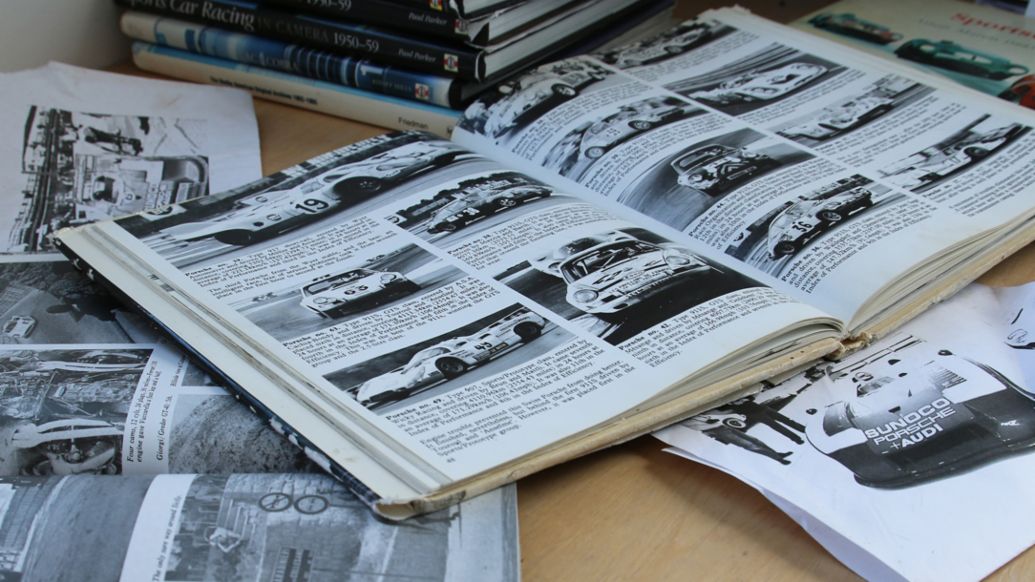
“To get things right, I do a lot of research. If you’ve chosen a certain moment in a certain race, you have to make sure everything is as accurate as possible: from the light at that time of day, to the advertising hoardings of that period. Somewhere like Monaco is a nightmare after 1958 when all the high-rise buildings started arriving. And cars can look completely different from qualifying one day to the race the next. Things might have been changed or been added overnight, like more louvres to improve cooling, or different wheels. I’ll even try to find out if the car had any accident damage during the race. It might have been covered in gaffer tape by that point!
“It’s seldom easy to find photos of a particular race, and even if you do, they’re not often in the ideal place for your finished piece. So, although I’d encourage working from archive material where possible, don’t be afraid to use a bit of creative license. Choose the best backdrop from the circuit in question and put the car just where you want it in the picture.”
Find your style
“I’ve been influenced by a few different artists, from George Ham, whose style is familiar to most people, even if they don’t know his name, to the very famous pop art of Roy Lichtenstein and Andy Warhol. It’s important that you find your own voice and look. That will only come with time and practise. I love post-war Grand Prix and sportscar racing, from the 1950s until you start creeping into the 1980s. I suggest you paint a period you’re passionate about – it’s the age-old adage about doing what you love and loving what you do. It will show in your work if you’re particularly passionate about the subject.
“I use a period palette, with powdery, vintage colours like greens and blues. Grey is a go-to colour at the moment. You can tone it in so many different directions with reds, blues and greens. Whatever you do, make your painting bright and bold. Don’t just place your car on a bit of tarmac – make sure it is doing something interesting. I tend to avoid wild oversteer, but most of my cars are in four-wheel drifts, so the wheels won’t be in line with the road. There are techniques to make a car look like it’s going quickly: angle it up a bit. If you have to tilt your head to look at a picture, you’ve already changed your perspective
“When it comes to the driver, have him or her tilting themselves over, because again it makes the viewer do the same, almost willing the car around the corner. Their hand on the wheel should be applying lock in the opposite direction. It can be very subtle, but if you don’t do this, subconsciously the viewer will notice that something isn’t quite right
“Human beings are hardwired to appreciate nature, so if you have something that’s too crisp it can look a bit soulless. It doesn’t have the same energy. Don’t be afraid of making things look irregular. A person, a tree, a crow – they should all be as irregular as possible. There’s a reason that old car design is so appealing and I think it is because someone has hand-drawn the designs, and someone has hand-built the car. It doesn’t look absolutely perfect and is better for that.”
General advice
“Along with humans and animals, cars are probably the hardest thing you can draw – particularly when they’re moving – so don’t be too hard on yourself. If you can do it at all, that’s a big achievement. You’ll have bad days, and when you get one, just move onto a different part of the picture, or a different picture altogether, and come back to the area you’ve struggled with when you’re ready. I look back on some of my pictures and I hate them, but I’ve still learned from those pictures.
“My pop art pictures look simple, but they’re anything but. The style is heavily reliant on perspective and flow, and with block colours it has to be neat. So it’s very time consuming. Be prepared for that. Patience is a must! As an artist, you can sit for quite some time doing nothing, just looking at your work, and you can feel like that time is wasted. It is not. That’s just part of the time it takes to do a picture. Looking is doing the picture. You just might not realise it at the time.”
